Rebrand & Positioning
Client: Coop Sleep Goods
Executed as VP of Creative in partnership with Herman Scheer Agency
I led the rebrand of Coop Sleep Goods from initial strategy through execution, beginning with an in-depth repositioning exercise that redefined the brand’s core identity.
Through competitive audits, consumer research, and stakeholder workshops, we identified an opportunity to evolve Coop from a purely functional sleep product company into a more emotionally resonant wellness brand. I translated those insights into a clear creative direction centered on personalization, comfort, and confidence—setting the tone for a new chapter of growth. The result is a brand that now feels as thoughtful and adaptable as the products themselves.
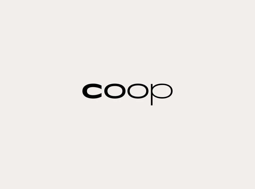
Before
The old logo didn’t evoke the emotional or sensory qualities people associate with sleep—like softness, comfort, or restfulness. It failed to support premium positioning or communicate the brand’s values—like personalization, trust, and innovation in sleep.
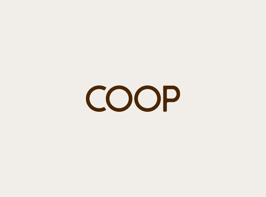
After
The new wordmark is all about balance—soft but strong, bold but approachable. When dropped into a pill shape, it reinforces Coop’s identity as prescription-strength sleep support. The versatility in the identity system solved many limitations from the former logo.


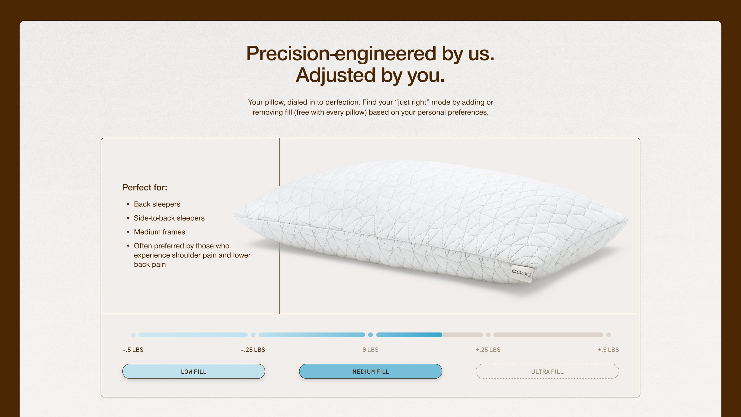


At Coop, we’re obsessed with helping people live a well-rested life. Our adjustable pillows and premium bedding are designed to support incredibly restorative sleep, so you can wake up feeling fully rested, fully present, and fully yourself.
